Plusdent. From leading the industry to being average.

Plusdent is one of my oldest clients, and I even had not created my company when I started working with them. (I established my IT company in 2009)
I was still a university student and my one-year exchange in Japan was decided. I first talked with the owner, who had years of managerial experience in digital marketing in the U.S. such as working at Ogilvy Agency in New York, of a digital agency which I worked for part-time. She said she can pay minimum wage monthly for the summer term, I refused and decided to go my own way.
Firstly, I came to my hometown and started cold calling small to medium companies that are shown on the second, and third pages of Google to offer them SEO and digital marketing services. It did not work out because at that time, in 2006 summer, most small business owners had not known anything about the existence of an SEO service, and they thought it is a kind of fraud.
Then I changed my strategy, and I created a website for myself for freelancing and I started advertising online. I got a couple of clients in Turkey & Cyprus at that time and one of them was Plusdent. When we decided to work, their website was uncompleted (somebody else was creating it but he could not finish it for months). So I took over the website and I completed their website while I was studying in Japan.
When I came back from Japan I made an offer to them to increase their sales for a commission from the increased part of gross sales.
Result: Monthly gross sales tripled in 6 months. How?
I had custom-developed analytics software installed on the website and I can see all the keywords which are used by the visitors. Currently, Google removed access to keywords if the user is signed in by their Google account for privacy reasons. So I made a summary of the high-paying patients and the keywords they use to access our website. Then I removed low-performing keywords, and also low-profit services and all the budget was spent only on the most important keywords which led high paying patients. So in the 6th month, the gross sales were triple their average monthly sales for the last 12 months before the project started. I was earning around 4000+$ (USD) / month from commission while I was still a student and the minimum wage was 430$ / month at that time in Turkey.
Not only ads but also marketing
Ads spending was part of the strategy, the design was innovative and uniquely created. Furthermore, the content was also important and it was well-written that supported with reviews and before-after pictures of patients. Apart from internet marketing, we also used classic marketing. For example, I suggest buying business clothes for the clinic secretary who was superb as a secretary but not good at choosing dresses for a premium dental clinic.
Some CTAs (call to action) I used 15+ years ago
(Note: I used Google Translate to translate images to English)
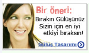
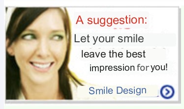
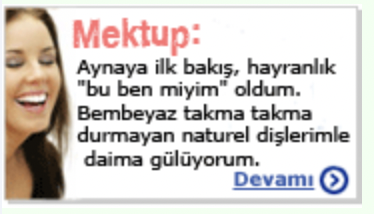
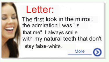
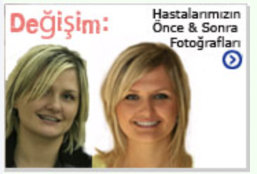
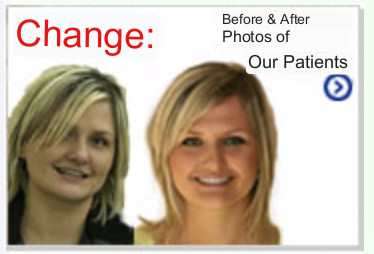
And a small hack to ads restrictions on the health industry in Turkey
There was also a strategy to get rid of the state’s limitations on the health industry at that time. Ads are prohibited for the health industry in Turkey. And if you publish reviews or before-after pictures on your website, the state thinks it is an advertisement and you got a fine. So I made the website to show pictures/reviews sections if it is visited out of Turkey. This was logical as the clinic targeted Europeans for dental health tourism.
SEO
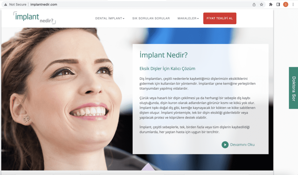
I dominated Google for Turkish keywords for dental services. Apart from the clinic website, we had microsites for different important dental services e.g. implantnedir.com (literally whatisimplant.com) for dental implants. So we were on the top pages for almost all main keywords on Google for dental treatment-related keywords.
Leading the industry
Many dentists/dental clinics were doing copy paste from our sites and they were also leaving links inside the copied texts, so they were giving us links unintentionally 🙂 And there were some dentists, who know me, who were saying that they are copying some concepts from our websites. They still use some slogans I wrote personally at that time, e.g. “Your Smile Reflects You” But actually had complementary subtitles, “and how you will smile is at your hands”, “nasıl güleceğinize karar vermek sizin elinizde”
Protetix.com
When we first met, their website was protetix.com, plusdent.com was on sale, and I made a price negotiation with the owner and bought plusdent.com for very little money, under 1000$.
Galip Gurel fetisishm
Galip Gürel is the best aesthetic dentist in Turkey. He is the founder of the Aesthetic Dentistry Association in Turkey. He was also president of the European Academy of Esthetic Dentistry between 2011-2012. He is also a teaching professor at New York University(U.S.), Marseille University (France), and Yedi Tepe University (Türkiye). He is giving seminars/courses to dentists globally in the aesthetic dentistry field. He has a book which is translated into 10 languages (Turkish, German) on aesthetic dentistry too. He is the dentist of celebrities in Turkey, e.g. Tarkan. As a result, he is charging 5x-10x more than any other experienced good dentist in Turkey 🙂 The full bio is here.
About his book by a dentist from Germany: “Best book in dentistry, the Bible”
When it comes to internet marketing, he is not a visionary at all. It was the same in the past and he sticks with this tradition even today. For example, his latest website has no mobile version, and he does not publish any of his work on social media. Most probably, he does not need internet marketing at all, word of mouth is enough for him. So he is a good leader in the aesthetic dentistry field to follow for a dentist but he is not a leader to follow for internet marketing of the dentistry field.
But our dentists (Plusdent), especially Onur, had Galip Gürel fetishism. They were suggesting things like “Galip Gurel is doing it this way on his website, we should do it like that.” I always replied with a clear “No” at that time.
(NOT) Opening a branch in Izmit, Kocaeli
I have a dentist cousin, Veysel Koç, in Izmit, Kocaeli. After I gained industry expertise in dentistry, I talked with him ( not for business purposes but rather to inform him), and I told him to provide dental implants & cosmetic dentistry services as they are more profitable services for a dentist. He did not interested in and he said “Who will get dental implant service in Izmit”, he complained about the high prices of dental implants. After 10+ years, he also started cosmetic dentistry and implant services in his clinic 🙂 My cousin did not have a website at that time (His current website was registered in 2017). Actually, there was no clinic which was using internet marketing in Izmit at that time. This is the same for most of the cities in Turkey, except Ankara, Izmir, and Antalya.
I also talked with Plusdent Dentists to open a branch in Izmit. We visited Izmit together and talked about this idea, but they also concluded that their services can be high for Izmit.
Compared to the past, there are probably 5x more clinics in Izmit now. There are also Istanbul-based clinics operating in Izmit too, for example, Dent Group (they have two locations in Izmit now). Ironically, the establishment date of Dent Group is the same as Plusdent, and they were not a player in the online market from 2006-2012 years but now have their own multiple clinics along with a franchise model in multiple cities in Turkey. Dent Group is now the biggest clinic in Turkey.
End of being my client, 2012
I stopped working with them in 2012 as our commission agreement was already broken and they were only requesting ads management services. I had bigger software and digital marketing projects from my Japanese multinational clients in Turkey (e.g. STARTS, H.I.S., J.F.E., Ajinomoto) and also from some small companies from Japan (e.g. Feileb, PhotoCreate) which I prefered to focus on.
The year 2023
Currently, they have a marketing guy (management graduate), a designer, and an ads manager in the team to manage internet marketing. And they just updated their clinic website last month, so I will write a review about it.
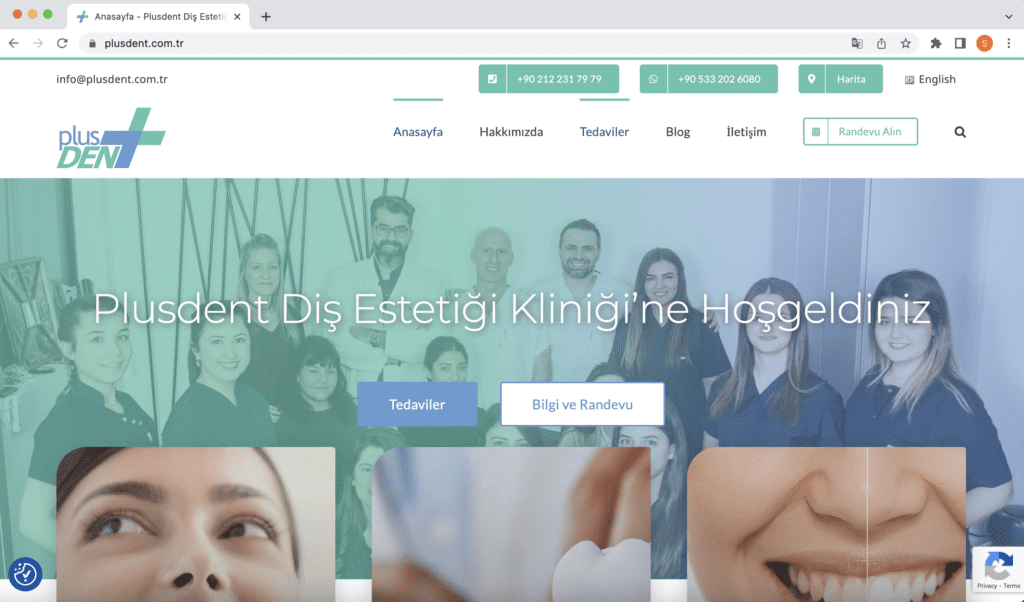
The Review
SEO
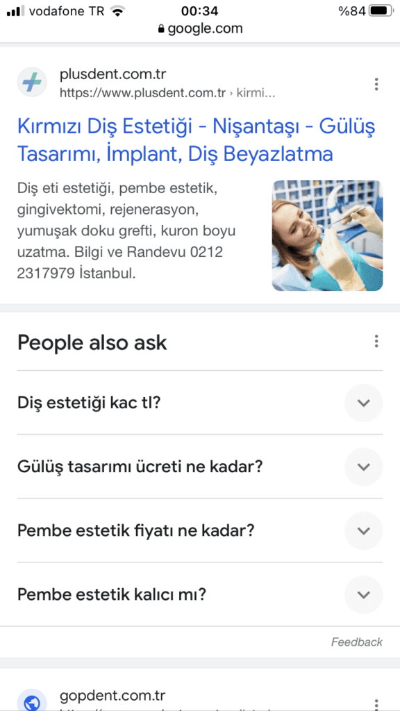
I will not go into SEO details, but they don’t rank for any important keywords that we were targeting in the Turkish language except pink aesthetic “kırmızı diş estetiği”.
Design is not unique
A ready-made template, Avada, is used by the designer and colours are modified according to clinic logo colours. This is ok for a company which has a limited budget, e.g. startups, small businesses, and NGOs. But I won’t suggest it to any established business which positions itself for a premium segment in their industry.


Not supporting all mobile phones
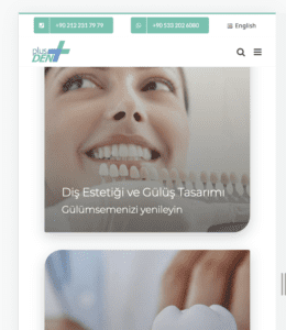
This is how the website looks if the viewport is smaller than 390px. 390px is not the screen resolution, all recent phones have higher resolution but their viewport is mostly between 360-450px. And a phone which has 360px viewport does not mean too old, there are brand new phones which has lower than 390px viewport. For example iPhone SE 2022, Samsung Galaxy Note 10/+, Samsung Galaxy S10. And that is also bad news for old but still in-use phones: iPhone 12 Mini, iPhone 11 Pro, iPhone X, iPhone XS,
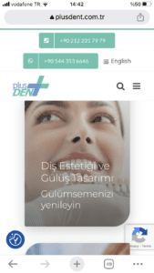
And the design for the rest of the phones
Update:
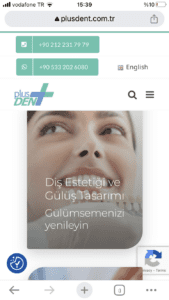
They made some changes while I was doing the review and now it looks like as below on all mobile phones. Still not the desired outcome.
Not mobile first
The website should be coded firstly for mobile, not for desktop, to be able to have faster load times on mobile.
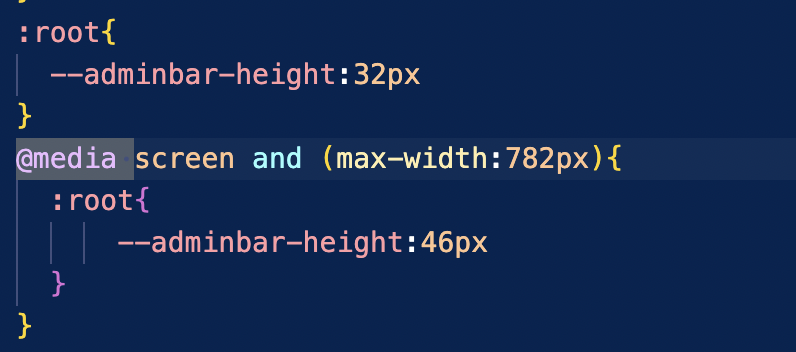
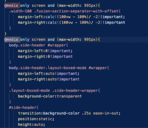
Not valid CSS code
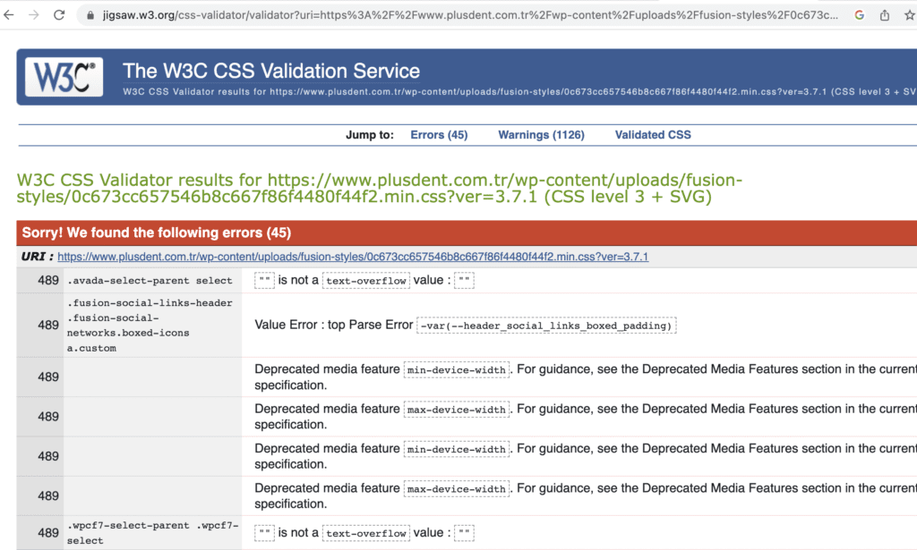
“Sorry! We found the following 45 errors”. This is for just the main CSS file, not including all CSS files.
Showing the wrong active menu item on the navigation
I’m on the homepage, and it correctly emphasizes the homepage link on the menu (Anasayfa), but it also emphasizes the link to the treatment (Tedaviler) which it should not.

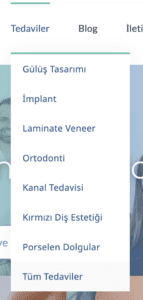
“All treatment” links to the homepage
Under the treatments menu, they have an “all treatments” link but it links to the homepage.
Unneeded recaptcha info on all pages
They have the Recaptcha plugin installed on WordPress. And Recaptcha is used to protect web forms for human confirmation (prevent access to forms from automatic bots). But what is the purpose of showing “We have Recaptcha plugin on our website” on all web pages? Moreover, it is quite annoying on mobile, when you click on it, nothing happens, and it is always shown on the mobile footer although the screen area is limited. On the desktop, when you hover over it, it shows the text info about what it is. This is also a good example of a UX problem you will have if you don’t use a mobile-first approach. It is designed to be shown full scale on hover but mobile phones have no hover feature 🙂
Desktop footer:

On mouse hover:
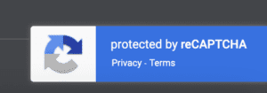
On mobile:

Same problem with Cookie Notification
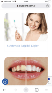
When you first visit the website, a cookie permission notification is shown, and it is the right behaviour after E.U. regulations on website cookies. But after getting confirmation, is it important to be shown on all pages, and make it sticky over all other webpage content? You can see the icon on the bottom left of the screen on mobile, all the time.
3 different custom font type is used
Montserrat, Lato, and Noto Sans with size variations. Custom fonts are a part of modern website design but usually, one font is enough in extreme cases you should not use more than 2 fonts because when you use custom fonts, you don’t download just one font file, you need to download all sizes you used with that font. That leads slow performing websites on mobile.
The wrong font size on mobile titles
In the desktop version, the titles and explanation texts are using relative sizes but on the mobile, the size is the same for both title and body content.
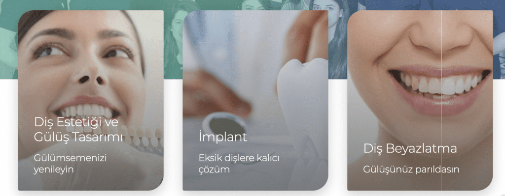
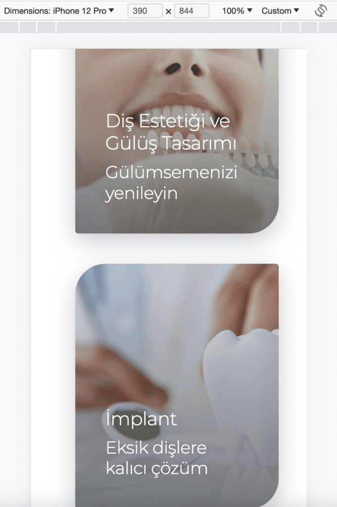
Icons are low quality (resolution)

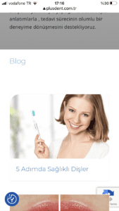
Blog header spacing problem on mobile
You can see the spacing between the image with the blog title.
Security issues (HTTPS, SSL) on mobile site
The exclamation mark is shown on the mobile browser. This is happening on many pages.

Logo has low quality on a mobile browser

Too much left-right margin for body text
Most of the titles are shown on two or three lines on mobile browsers as the margin is used way too much for small screens.
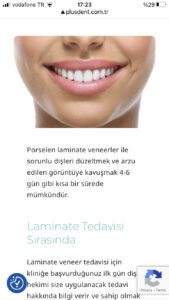
The wrong bottom margin on mobile headers for some pages.
Compare the space at the bottom of the “Diş Hekimlerimiz” title on the first image with the “Laminate Veneer” title on the second image.
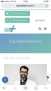
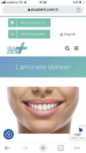
Google map is not working
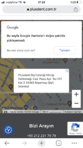
Inconsistency in icon designs
Whatsapp and map icons don’t have backgrounds whereas the phone has a white background, its type is the inverse of other icons.

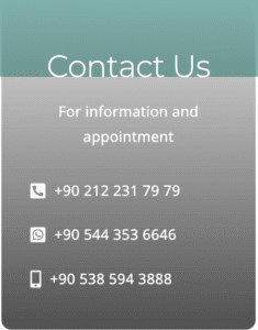
Lastly, slow loading time
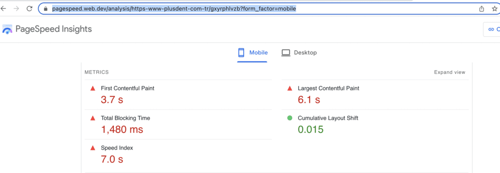
The mobile speed index is 7 seconds which is expected to be below 2.5 seconds. To check the live report from the Google Page Speed insight tool, click here.
Conclusion
There are also other design, UX, and coding problems on the website. I think it is enough for a review. The website is actually just updated last month.
When I started working with them they had less experience compared to their current experience level as dentists. At that time, when patients visit the clinic, they were expecting a big dental hospital as the brand image created on the website was very high. Now dentists have more expertise, more reviews and a better clinic facility but the website does not reflect it at all.
When I wrote a blog about Togg’s website, one of my friends said “I hope their car will not be buggy as their website.” So same comment can be used for the clinic’s services too. Actually, Togg’s website did not have many design problems, it had a good custom design but buggy implementation.